
Democratyzed!
This was a project done through Flatiron School's part time UX/UI Design program. Through the span of 8 weeks, myself and a partner worked with a real client - Democratyzed - to each produce a set of design systems they could use in the future if they chose to implement any of our design work.
Our client has a website for Virginia citizens to connect with their legislators and stay up to date on different bills and legislations under consideration. If the website is successful and gains enough traction, there is a plan in place to roll it out nationally.

The Design Goal
The client’s main design goal was to modernize the existing website and to improve the user interface to create a more intuitive experience.
My Design Approach
The existing website was very white and bland, so my approach was to incorporate more color and to spruce up the layout to avoid mirroring Facebook directly while still maintaining a layout that is familiar and intuitive to the user.
Through the strategic use of color as a CTA and implementing a non-traditional winding divider line in the timeline view, I attempted to set Democratyzed apart from other similar websites.
Moodboards
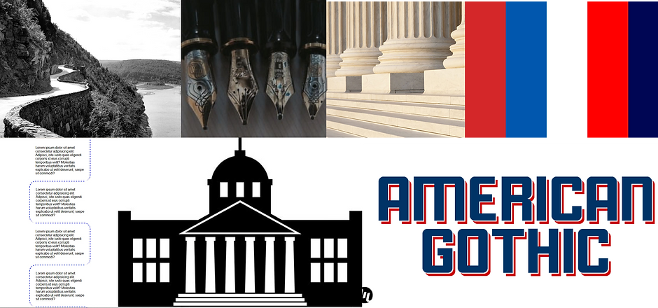
When drafting the moodboard, my main idea was to use the colors of the government in a bi-partisan way with the intent to come across as trustworthy while still being approachable and familiar. There were three iterations of moodboards and this one was the favorite among both the client and the people we interviewed.
Style Tile
I also did three different style tiles and settled on this one because the client seemed more drawn to this design than the other two.
I attempted to break up the traditional social media timeline feed which is usually presented in blocks of text by implementing the winding road divider line to separate legislator posts and posts related to legislation.

High Fidelity Designs
Round One
The top section of each screen is swipe-able on the mobile version, displaying the user’s top notifications. If user is viewing as a guest, top news stories are displayed in place of notifications. I also used a black background to try and differentiate from the usual social media website, but still keep familiar elements such as the 'compose post' window towards the top.
The desktop version had words along with images on the navigation based on client input that the majority of users access the website on a desktop computer, so the thought here was that they would already ideally be familiar with what icons go with what navigation button.
Mobile Designs


Web Designs


User Testing
Methods Used:
Three rounds of user testing were conduced between myself and my design partner. We tested each other's designs with different people in each round.
In the first round of testing we presented our moodboards to two different users remotely using the Microsoft Desirability toolkit to gauge first impressions of our mood boards.
In the second round, we showed users our High Fidelity prototypes. To measure their responses, we used preference testing, involving asking questions such as “which of these designs to you find to be more trustworthy? Why?”
During round three, we used the ‘speak aloud’ protocol in which users were given tasks and asked specific questions about certain pages to gauge the effectiveness of each designed page on our second attempts of High Fidelity prototypes. For example, on the Homepage of one design iteration, one of the questions was “Do you have any thoughts on the layout?” or “What do you think you can do on this page?”
User Findings on High Fidelity Prototypes Round 1
-
When hi fidelity designs were presented to users, they found the menu icons confusing as they didn’t understand where they would lead.
-
Users found the layout intuitive and understood how to interact with posts.
-
They didn’t know how to customize what legislators were visible to them or how to adjust what legislative interests they had.
-
The black color was cited as being difficult to read
Mobile Designs
High Fidelity Designs
Round 2
Since users had mentioned the black being difficult to read, I changed the background back to white and added words to the navigation buttons so there would be no doubt where they would lead.
After some trouble with how to condense the navigation, I tried a new form on the legislator page surrounding the legislator picture. I also added an ‘edit’ button to both the interests page and the legislators page.
For the desktop version, I tried formatting the page without the dividing line to see if it was an improvement in layout and user functionality.


Web Designs


User Testing with High Fidelity Prototypes
Round 2
Methods used
Speak aloud protocol was used as well as a brief design survey.
Findings
Users had trouble with the font choices, stating that they felt ‘off.’
Menu icons with words was a successful change, users were able to navigate through the pages.
While using the new navigation was successful, the orientation of the menu was a pain point: too many buttons too close together.


Final Designs
In the mobile version, I made the picture on the top smaller to cover less real estate and leave more for the content itself.
I reinstituted the dividing line but made it very subtle. I also unified the font, making it simple and all the same.
I simplified the logo to make it just a D in the upper left corner, reminiscent of other familiar social media websites.
I also further refined the navigation, using menus and drop downs and hamburger menus
Design System
As part of our deliverables, I created a design system so the client could apply any of these design features in the future if they so chose.


What I Learned
This was a huge learning experience for me. Working for a real client and being under such tight deadlines was a real motivator. Despite scheduling and time management issues, I was proud of my end designs. They were well received with the client and were my most well put together designs of the program. If given more time, I would have spent more time in user research. I probably could have gained more useful insight and been able to make even better adjustments to my designs.