
Vente
A UI Design Case Study
Project Overview
The project brief was to create the visual design for a mobile platform that could help people search and find activities and events in their area that reflect their interests. This was a student project for Flatiron's part-time UX/UI Design program.
Competitive Research
Several websites designed to help people find activities near them exist already. Websites like Meetup and Eventbrite focused on helping people find other groups of people that were interested in similar things. Both websites used simple color schemes and focused on the content by using a grid layout and featuring search windows towards the front of the homepage, allowing the user to begin their search right away.

Design Approach
I wanted to take the idea of events and make it exciting, which to me spurred images of the 1980's, specifically synth wave/cyberpunk elements with bright neon colors.
Above all, I wanted to emphasize fun and make users excited about using the product.
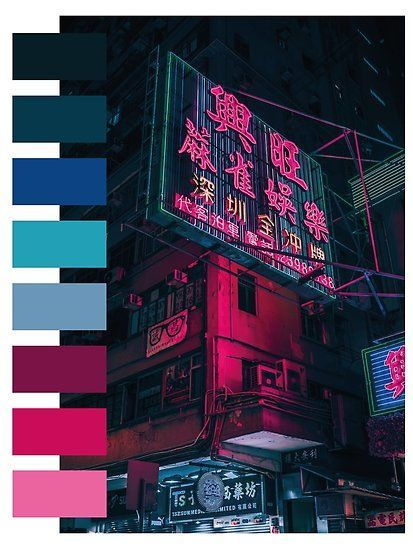


Style Tiles and Logo Design
The logo was a struggle. In my search to come up with three different ways to embody 'fun' and 'excitement' that events can invoke, I also came up with a more woodsy, summer camp sort of vibe as well as a more artsy, theatrical vibe. The logo went from looking like a wooden sign to a spotlight to a marquee sign, going through various levels of detail. Finally, I decided to go with my gut and stick to the 80's style neon design direction.
I wanted the logo to look like a marquee sign outside of an exclusive club, much like Studio 54 in New York. I also used bolder colors to support the ‘fun’ and ‘cool’ adjectives I wanted to embody.


First Round of Designs
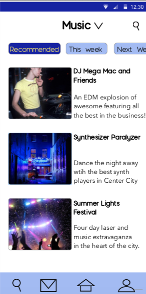
In my first round of design, I wanted to set Vente apart from other similar apps and use a black background for easier legibility utilizing the neon lights of a marquee sign aesthetic when it came to the color of my fonts as well.


User Testing
One round of user testing was done in person. Two users were given tasks to complete within the high fidelity prototype and questions to answer.
The first user navigated the prototype well, noting the only pain points to be the lack of an obvious back button and certain color inconsistencies. His recommendations for improvement included prototyping more pages: he wanted to get the full experience of purchasing a ticket or signing up for a class or event.
The second user had a similar experience, while noting that one of the screens didn't seem to be necessary.
Overall, visual direction was well received.
High Fidelity Designs Final
After some website accessibility tests, I realized that the black background might not have made for as easy reading as I had originally thought, so I changed tactics and used a white background, similar to websites like Meetup and Eventbrite. I also focused more on using visuals in the menus and making the content the focus.


What I Learned/
Final Thoughts
This was my first time really focusing on UI Design in the program and adjusting designs according to user testing feedback. This was a big learning experience and if I had more time on this project, I would have diversified the layout even more. I stuck too closely to the original wireframes I was given and this could have been a very creative and awesome app. I learned to trust my instincts more and stick to my creative design then the designs might have been even more successful.