
Getting Redesign-ey With It
- emilyshaindlin
- Oct 14, 2020
- 5 min read
Throughout my time in Flatiron, I felt repeatedly frustrated with myself for not getting around to the extra credit assignments. I always just barely had time to really focus on the main assignments. So I am grateful for this chance to revisit some assignments I had wanted to complete earlier.
This week, we are attempting a website redesign. Now, the instructions say "[...] a website you really like" and most of the websites I really like I feel like already have a really good design scheme. Facebook (despite it's many iterations over the years), Instagram, and Youtube. However, I began to wonder how YouTube could look if it had taken, shall we say a "darker" design turn?
First things first: I had to generate a list of what was already on the current website homepage (of an existing user). Aside from recommended videos, what were the menu options and how were they organized? Could I come up with a better way to organize them?


After writing down all the menu options, it was time to move my findings into a sketch file where I could begin organizing and hopefully start to see patterns. This has never been a strength of mine, so let's see if it's something I can master.


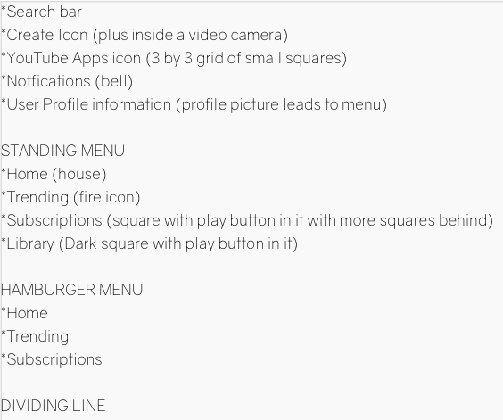

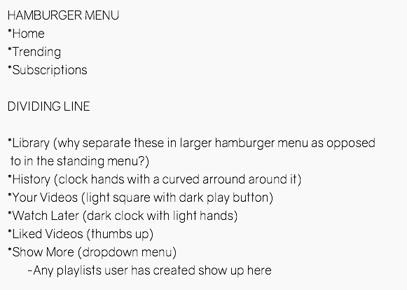
Upon first glance, there were a couple questions I had. In the menu that appears when you first open the page, the options for Home, Trending, Subscriptions and Library are grouped together, but in the deeper expanded hamburger menu, the Library option is grouped instead with 'History' 'Your Videos' 'Watch Later' and 'Liked Videos'. I found this interesting at first but then after going back to the website and following the buttons, it made more sense.
Library takes the user to see their history, liked videos and playlists like 'Watch Later' so it makes sense that this would be featured in the standing menu as a quicker option to get to these lists, whereas in the expanded menu this option goes at the top of the list of pages it features: History, Liked Videos, Watch Later and Your Videos. Guess all those weeks of schooling are starting to pay off!
Ok, now that I have a list of what menu options to keep, let's see if there's any domain research I can do. We all know that YouTube is the most popular of the video sharing websites, but what other options were out there and what were they doing differently?
According to Beebom.com, a consumer technology website aimed at helping people understand and use technology in a better way (About Us,beebom, 2020)
Vimeo comes next on the list of Top 10 Best Video Sharing Sites You Should Use.
This list kindly provided a screenshot of the homepage, which looked very similar to YouTube but...I'm not sure...more streamlined? More mature? Maybe this will come with time, but the proper adjective doesn't quite come to me at the moment.

The title of 'human-curated Staff Picks' is intriguing wording to me, as many YouTube creators have gripes about the YouTube algorithm playing videos of lesser quality content and boosting creators who perhaps aren't as creative as other trust unique voices on the platform. To have humans performing this task instead of an algorithm puts me, the user, at slightly more ease.
Overall, in terms of design, Vimeo feels more geared toward adults in the film industry and established professionals looking for a platform to host their reels while YouTube has been taken over by a wide range of creators, a large amount of them teenagers and very young adults.
What if these attributes were reversed and YouTube was the platform for the more established film professional? How could I take a website dominated by gen Z and give it a professional upgrade?
First thing was first: the layout. The homepage already had a pretty effective layout so this wasn't in need of a huge re-invention. Focusing firstly on how the menus were arranged, I wondered if there was any value in eliminating the need for two levels of menus and having all the menu options available upfront. This would be tricky for mobile, but maybe I will attempt that redesign challenge another day.

I wanted to see if a different font would invoke a different emotion, a more professional emotion. Admittedly, font choice is not my strong suit (something I was shocked to learn as growing up I loved choosing different fonts for each new novel I would begin writing), so this is something I'm still not entirely certain of. However, I feel like my choice, Atami Regular at 21pt, is effective at being professional but also approachable. My first draft also included the smaller icons with the idea that these would be used in the responsive mobile design. I also feel that there is something a little smoother about not capitalizing menu options. Though it may not be appropriate for all projects, if felt like the effective amount of friendly approachability and streamlined professionalism.
I kept the red color from the current site, upgrading it with a black gradient. I also tried to upgrade the logo, putting the YouTube into a small TV graphic. However, I wasn't sure of the font choice, so I drafted a few more options.

I liked the idea of the TV, making it a literal you "tube", but the font choice of the first one felt too reminiscent of the current website, so I turned my focus to the second logo from the right, however it felt out of place with the first layout that I had drafted. Something also felt off about how I had arranged the video information on the thumbnails I drafted. So I suppose an entirely new design was needed.

Upon closer look, the side menu also felt wrong. I had gotten some negative feedback during phase 3 for putting the menu on the side of the screen and taking up valuable real estate on a menu, so I moved the menu up to just below the top banner and left more real estate for content. I got rid of the red and tried just a sleek black banner on the top, hopefully creating a more streamlined and professional looking.
Overall, trying to redesign a website I've visited often was a useful exercise. At first I wasn't sure what to try, seeing as I use the website daily and am already accustomed to the layout and user flow. It was good to try and think outside of the box and I think this will become a useful skill in my future career. I may revisit this design challenge in the future.
Beebom.2020. About Us |Beebom. [online] Available at: <https://beebom.com/about-us/ [accessed 8 October 2020]
Beebom.2020. Top 10 Best Video Sharing Sites You Should Use. |Beebom. [online] Available at: <https://beebom.com/video-sharing-sites/ [accessed 8 October 2020]


Comments